Many of you will likely remember the “Under / Over” debate during the planning phase of running the Silver Line through Tysons. One of the chief complaints of elevating the rail tracks was the “unsightly concrete infrastructure” that would supposedly ruin the open views of Tysons.
Today we have elevated rail running through the heart of Tysons. Love it or hate it, it’s here to stay, and it’s bold presence is a defining feature of the city. The vertical concrete supports for the metro, the pylons, are transportation infrastructure, purely functional, and not particularly elegant. The stout trunks are visually heavy, and at some points align to create a concrete wall from the drivers vantage point.
Following the busiest roads, engineered medians, and islands between interchanges, the area under and around the pylons is unsuitable for occupied space. These spaces belong to the roads and tracks, and the speeding metal they carry. As such, any remediating design should be at a scale appropriate for infrastructure.
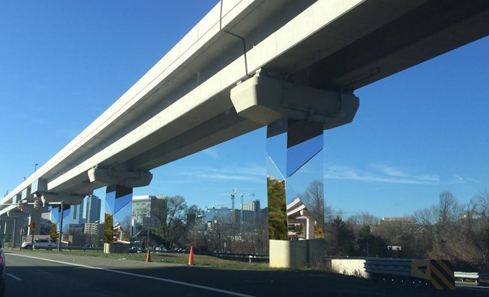
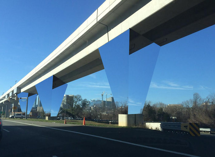
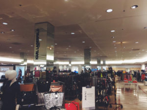 Mirrors possess the ability to make objects seemingly vanish. With the pylons on my mind, I thought about the other materials of Tysons — the dark glass, high polish floors, and glinting metals.
The pylons should utilize materials of light and reflection — already characteristic of Tysons — and apply them to the naked concrete. Case and point: mirrors as a design solution can be found in Lord and Taylor in Tyson Mall. The effect would be a Silver Line that seems to float above the ground and a (seemingly) less obstructed viewshed.
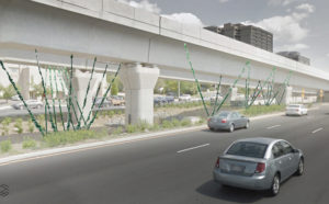
Another solution might be to landscape the median. However, this would call for careful consideration of the plantings, as large trees would quickly become a maintenance issue, VDOT, and Metro hazard. Alternately, a system of cable and mixed vine species could provide year-around green, in a system designed to complement the scale of the infrastructure and the patterns of Tysons. Vines are fast growing, lightweight, trainable, and in combination with simple cables, can make for a flexible design.
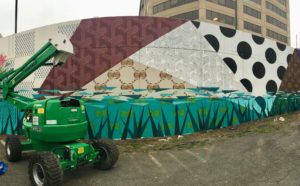
Seven pylons (some of the tallest) between Capital One’s new office and Rt. 123, present a great design opportunity to frame the company’s entrance. This is one example of grouping the pylons, helping them to become part of the urban fabric, with themes patterned to differentiate neighborhoods and districts within Tysons, bringing infrastructure into conversation with the city.

