Greater Greater Washington recently posted an article discussing how to retrofit the suburban/office park region of North Bethesda to be more pedestrian friendly. The discussion had a lot of great points and really pinpointed the key elements that are lacking in pedestrian design for areas that were developed under the suburban office park model. These issues range from safety (lack of lighting, beg buttons, signage) to functional (mid-block crosswalks, full intersection with crosswalks, medians for pedestrians). The total list was as follows:
- Pedestrian oriented lighting
- Crosswalks on all sides of intersections
- Replace beg button signals
- Pedestrian oriented medians
- Better signage
- Remove slip lanes
- Mid-block crosswalks
- Fill in missing sidewalks
There obviously is room to discuss and debate the merits and applicability of each of the above elements, although it is a pretty succinct list of how to take very dangerous — or unused — pedestrian conditions and make them better.
One element that likely is not useful in the discussion of suburban retrofits is #3, while beg buttons are a nuisance and prove that DOTs for a long time have all but ignored anyone outside of a vehicle, they are a necessity in any location where signal timing is car oriented. Most of the time these buttons are a placebo anyways, put to appease folks much like the close door button on most elevators. If you press the button at Route 7, it’s very unlikely you are really going to get any variant in timing in the signal at the intersections.
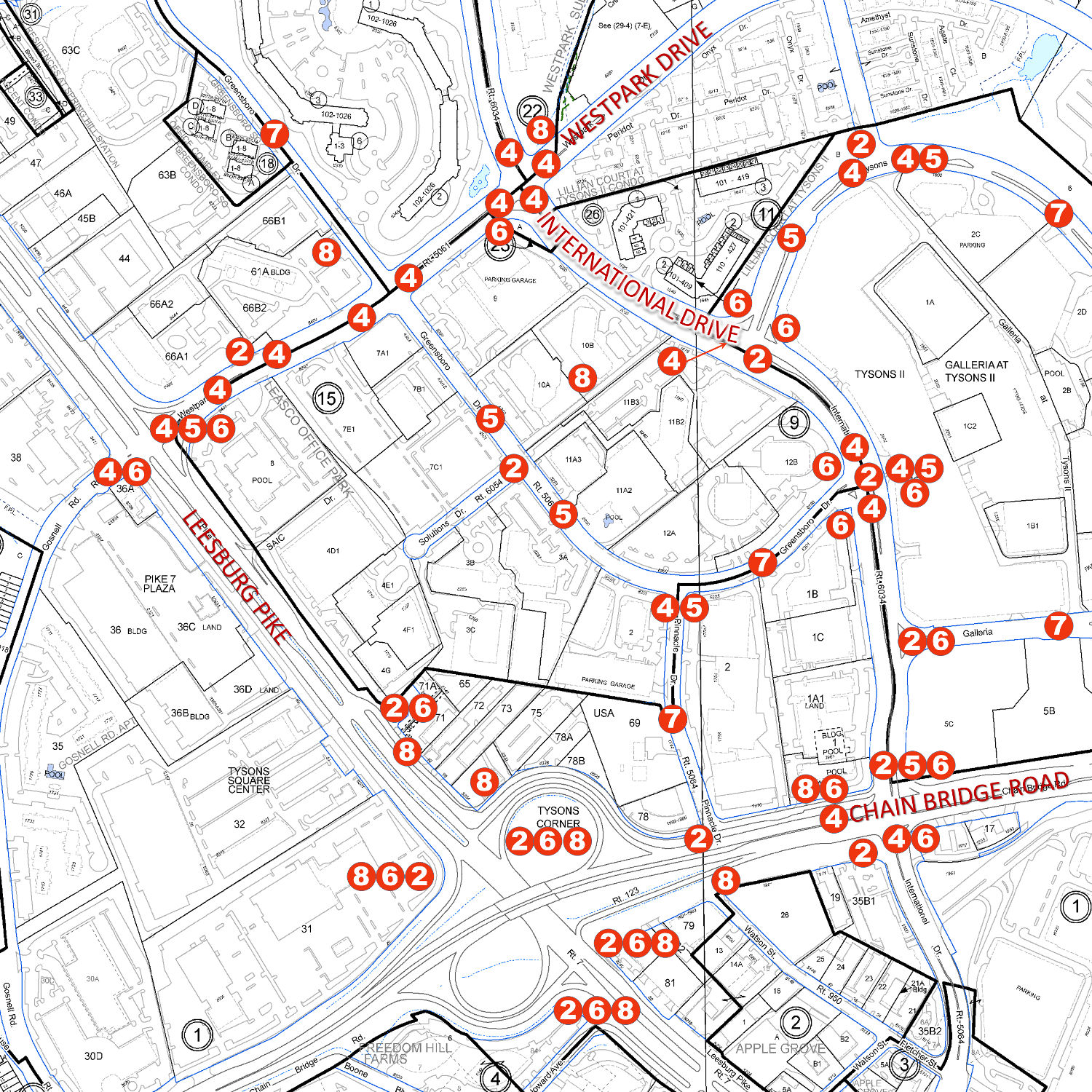
The remaining 7 issues are not just appropriate in Bethesda, they are appropriate in Tysons as well — maybe more so. This is a good opportunity to assess our growing city to determine where our DOTs and planners need to focus and adjust their thinking if they want to put their planning pen (it’s really more likely a planning mouse/CAD software) where their mouth is. The below map inventories all the locations, just in Tysons Central 7, where the above elements are not being adhered to:

All of the proper planning considerations above are violated. Note that #1 is not denoted anywhere on the drawing because it is ubiquitously bad everywhere — yes everywhere — in Tysons.
For decades all lighting for roadways has been just for that, the roadway itself, while critical lighting for sidewalks and crosswalks have been ignored. This creates not only an aesthetically ugly nightscape but also extremely dangerous conditions for those who are most at risk on roads, pedestrians. This is especially important now that we are entering the no-sun rush hours of fall and winter; despite years of begging and prodding no one has yet to address these critical needs even at the most utilized of intersections (near metros and near major offices).
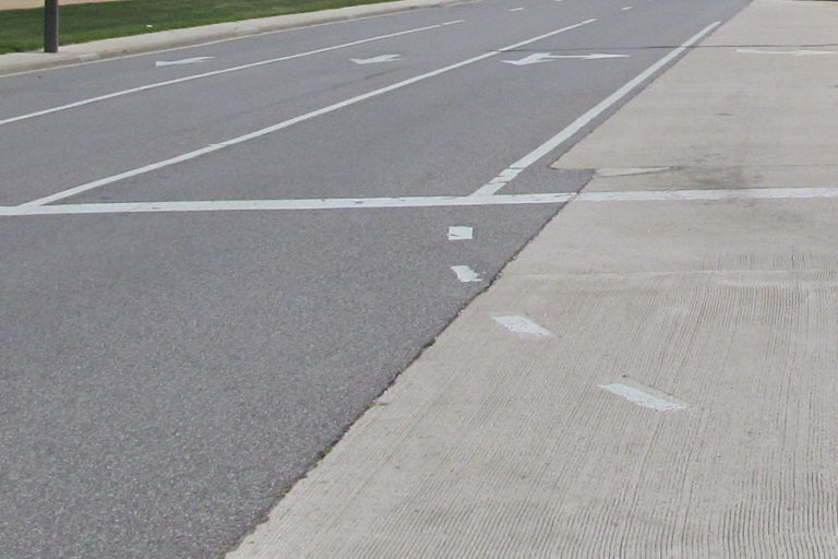
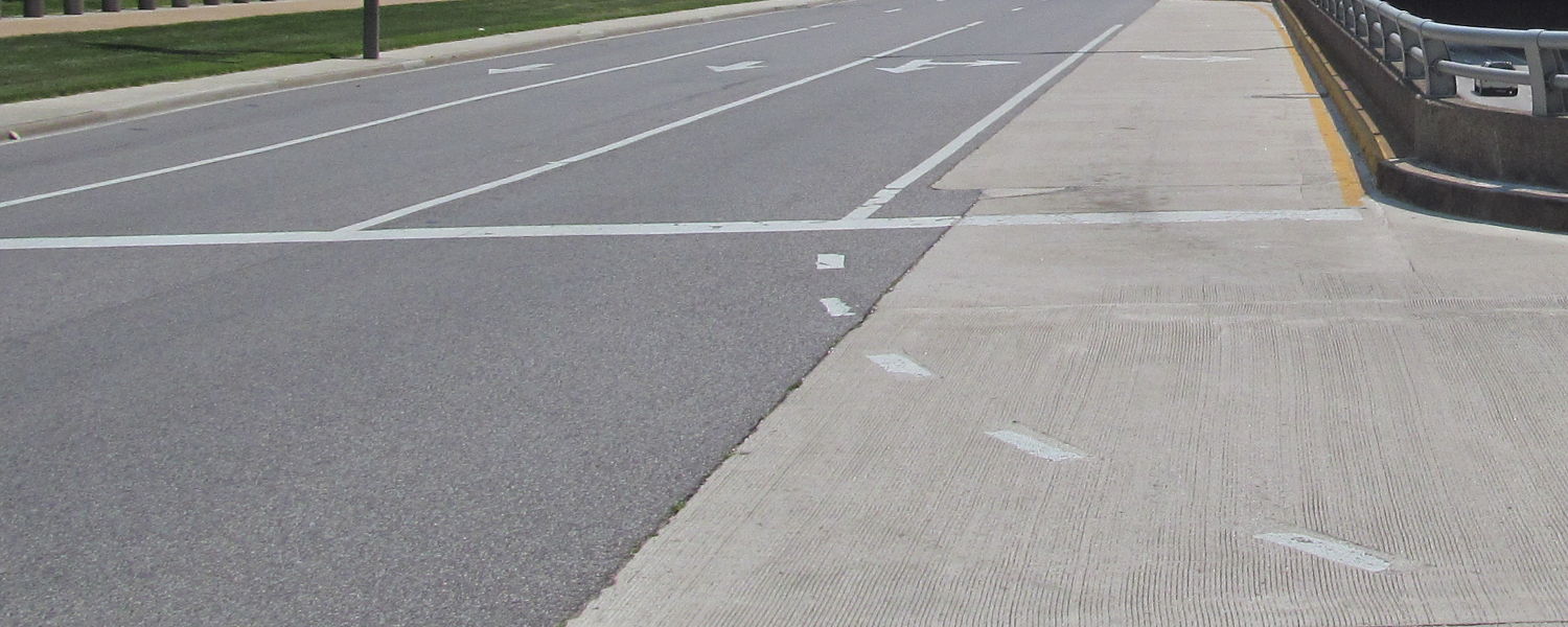
Another obvious issue are the slip lanes, that were normalized in Tysons for nearly every road. Slip lanes make no sense in this context. Every road in Tysons is either 35mph or less in speed, so can any planner or DOTs designer tell me why we need high-speed slip lanes anywhere? This kind of design is why despite 35mph (or even 25mph in some cases) speed limits we routinely see excess speeds of 55mph and more on our roads. It isn’t the drivers fault, it is a failure of our planners and leaders to properly provide urban infrastructure?
Thankfully, that is beginning to change, but it isn’t happening quickly enough due to entrenched opposition at some of the highest levels of decision making. Which is why it is critical for us to create this inventory, as an assessment nearly a decade after people began recognizing the error of previous planning eras in Tysons, to see what really has been done. The answer is, too little, and we need voices and the people to tell those who can easily implement these kinds of changes to do so now.
No more 6-month studies that become 2-year studies, that become buried paperwork that never sees the light of day. It is time.


